1
Multi model AI access
Aggregates different AI models like Claude, praised for flexibility but sometimes confusing to newcomers.
UseAI is a subscription based AI assistant hub offering multiple models like Claude for writing, research and translation. It suits users wanting fast answers but has strict limits, billing complaints and inconsistent image generation quality.
Independent review — we test tools ourselves and analyze public user reviews. How we test.
UseAI delivers quick, often accurate text responses and translations, and many reviewers find it easy to use and good value, especially for research and drafting documents. However, complaints about heavy daily usage limits, slow or stalled generations, weak image results and vague answers appear frequently. Billing practices, trials converting to paid plans and refund handling draw particularly strong criticism and accusations of deceptive subscriptions. It fits budget conscious users who mainly need light text assistance, but heavy users, creatives relying on images or anyone sensitive to unclear billing should approach cautiously.
Use.ai is a subscription wrapper around other companies' models. Pay one company, get one chat window, point it at whichever engine suits the job instead of paying OpenAI and Anthropic and Google separately while keeping four tabs open to switch between them. The count they advertise is more than 25 models, with GPT-5, Claude, Grok, Gemini and DeepSeek named among them, and the product stretches past chat into web search, document analysis, deep research, image generation, and a team layer with shared projects and files.
"Wrapper" is my word. Use.ai makes the same point in its own way, on the landing screen, before you type anything: a line under the input box says the site provides access to third-party AI models and that the company holds no affiliation with or endorsement from the owners of those models. Nothing running here belongs to them, which means access to the models is the entire product. The paywall cannot sit in front of an advanced feature the way it does at OpenAI or Google. It has to sit in front of the conversation.
Aggregates different AI models like Claude, praised for flexibility but sometimes confusing to newcomers.
Helps draft documents and chapters, often rated effective with deep, aligned responses.
Supports images and flyers, frequently criticized for inaccuracy, spelling errors, and ignored edits.
Provides quick translations, mentioned positively as good and accurate.
Strict quotas that can block access after few prompts, widely criticized by paying users.
Free trials and discounted offers, heavily criticized for confusing automatic billing and perceived traps.
Interface often described as easy and intuitive, though some find specific actions unintuitive.
Used for research and resources, generally praised for making work faster.
Assists with design decisions and layouts, but occasionally misinterprets spatial instructions.
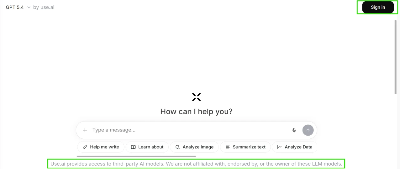
I opened the site without logging in first, just to see how much it would show me. A Sign in button sat in the top right corner. Over on the left, the model name read GPT 5.4 by use.ai. The middle of the screen held a How can I help you? greeting above a rounded prompt box, with a row of shortcut chips underneath for writing help, learning about a topic, image analysis, text summarising, and data analysis.
What pulled my attention was the thin line of text sitting directly under the input box, which I highlighted in green. It states that the site gives access to third-party AI models and that the people running it are neither affiliated with nor endorsed by the owners of those models. I have used a lot of chat interfaces and almost none of them put a disclaimer like that on the landing screen before you type anything. It reads like a legal shield, and finding it before my first prompt shaped how I read everything that came after.
The page itself loaded fast and nothing was broken.
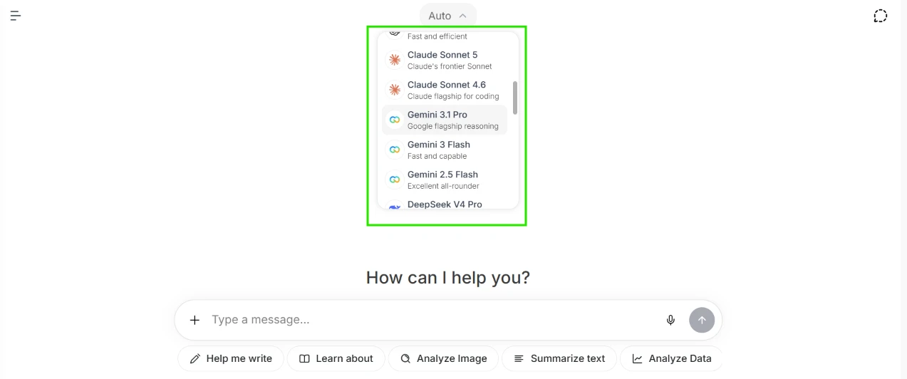
Next I clicked the model selector at the top. The dropdown opened with Auto pinned at the head of the list, and below it a scrollable column of names. I could see Claude Sonnet 5, Claude Sonnet 4.6, Gemini 3.1 Pro, Gemini 3 Flash, Gemini 2.5 Flash, DeepSeek V4 Pro, and the scrollbar told me there were more sitting below the fold. Each entry carried a one line description under it, which made the list quick to scan.
The scrolling was smooth and the panel responded straight away. My honest observation is about what the menu leaves out. Not one model in this list is marked as paid. No lock icon, no Pro badge, no greyed out row, no tooltip. Sitting there as a logged out visitor, I assumed I could pick any of them and start talking. That assumption turned out to be wrong, and I only found out several clicks later.
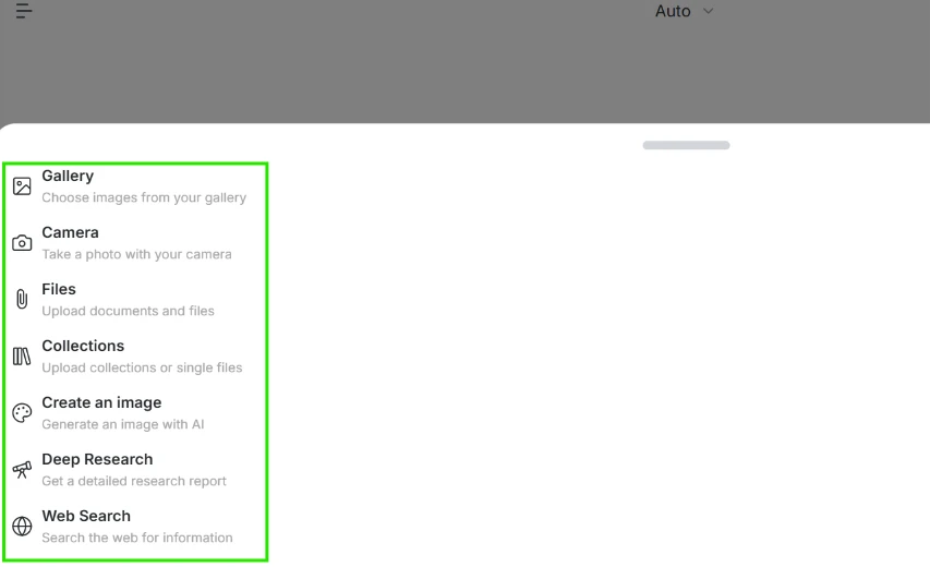
I pressed the plus button beside the message box to see what I could send along with a prompt. A sheet slid up over a dimmed page with seven options on it: Gallery for images already on my device, Camera for taking a fresh photo, Files for documents, Collections for uploading either single files or whole sets, Create an image, Deep Research, Web Search.
Two things stood out here. Camera on a desktop browser felt like a mobile menu that had been carried across without anyone asking whether it belonged. And Collections sits right next to Files with a description that overlaps it enough that I could not tell what separates the two.
The background went almost fully grey while the sheet was open, so I lost sight of the chat behind it.
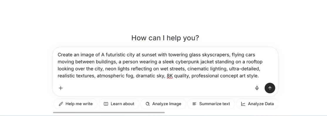
I chose Create an image and typed a deliberately heavy prompt, the kind I would actually use if I were testing a generator properly: "A futuristic city at sunset with towering glass skyscrapers, flying cars moving between buildings, a person wearing a sleek cyberpunk jacket standing on a rooftop looking over the city, neon lights reflecting on wet streets, cinematic lighting, ultra-detailed, realistic textures, atmospheric fog, dramatic sky, 8K quality, professional concept art style."
The tool stuck the words Create an image of onto the front of my text by itself. So what appeared in the box was Create an image of A futuristic city at sunset, capital A still standing where the prefix now runs into it. It is a small thing. It also means the product is editing my prompt before the model ever sees it, and it did not tell me that or ask.
The input box grew to hold three lines without forcing me to scroll, which I liked. The browser spellchecker underlined 8K in red. The model selector scrolled out of view once the box expanded, so at the moment I hit send I could no longer see which model was going to handle the request.
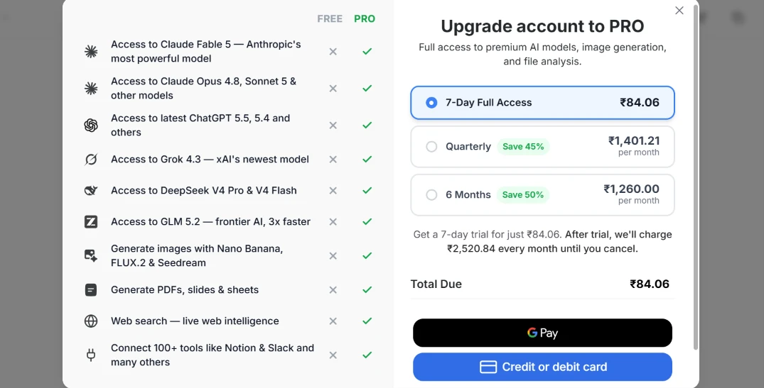
I pressed send. No image came back. A paywall took over the screen instead.
The left half is a comparison table with nine rows, FREE against PRO. Access to Claude Fable 5, access to Claude Opus 4.8 and Sonnet 5, the latest ChatGPT versions, Grok 4.3, DeepSeek V4 Pro and V4 Flash, GLM 5.2, image generation with Nano Banana or FLUX.2 or Seedream, PDF and slide and sheet generation, live web search, plus connections to over 100 tools. Every single cell in the FREE column is a cross. Every cell in the PRO column is a tick.
The right half sells the subscription. 7-Day Full Access at ₹84.06 was preselected. Below it, Quarterly at ₹1,401.21 per month carrying a Save 45% tag, and 6 Months at ₹1,260.00 per month carrying a Save 50% tag. Under those, in smaller grey text, the terms: pay ₹84.06 for the trial, then ₹2,520.84 every month until I cancel. Total Due showed ₹84.06. Payment through G Pay or a card.
The pricing took me a second read. The trial is ₹84.06 and the recurring charge after it is ₹2,520.84, which is thirty times the number in the button I had selected, printed in text half the size. The Quarterly plan advertises ₹1,401.21 per month at a 45% saving while the 6 Months plan shows ₹1,260.00 per month at a 50% saving, so the longer commitment is cheaper per month even though the two rows sit close enough to blur together.
The timing bothered me more than the numbers. This popup appeared after I had written and sent a long prompt, not when I selected Create an image, and not when I picked a model from a dropdown that never once said the models were locked.
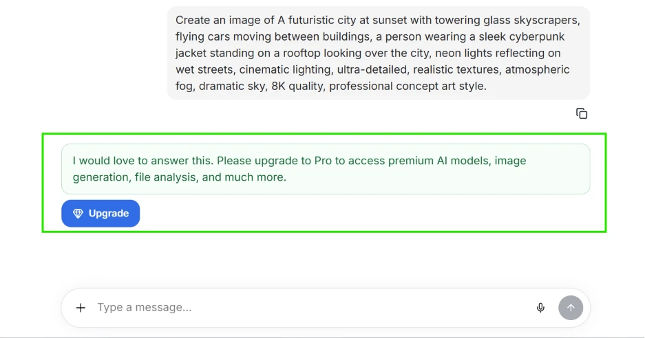
I closed the popup to see whether the conversation itself had produced anything. My prompt sat at the top in a grey bubble with a copy icon beneath it. Under that, in a green tinted box, was the reply: I would love to answer this. Please upgrade to Pro to access premium AI models, image generation, file analysis, and much more. A blue Upgrade button sat below the text.
No partial image. No low resolution preview. No watermarked sample.
The reply landed instantly, with none of the pause a real generation takes, which tells me nothing was ever sent to a model. The phrasing is what I would call friendly pressure. It says it would love to answer, which frames the refusal as enthusiasm rather than a block.
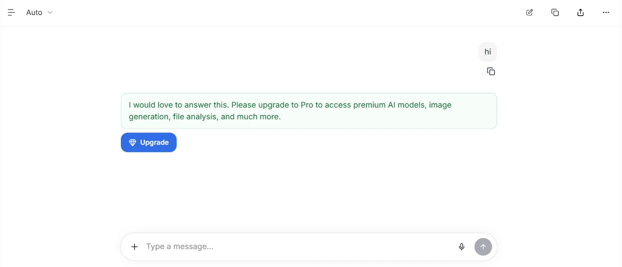
At this point I wanted to find the actual boundary of the free tier, so I opened a fresh chat and sent one word. Just hi.
Back came the identical green box, the identical sentence about upgrading to Pro for premium AI models and image generation and file analysis, and the identical Upgrade button.
A two letter greeting is not premium model access. It is not image generation. The chat still accepted my message and rendered a reply bubble as though something on the other end had processed it. The model selector at the top still read Auto, still clickable, still offering me a choice that leads nowhere. Whatever a free account means on this platform, it does not include a single exchange of conversation, and I only learned that by testing it.
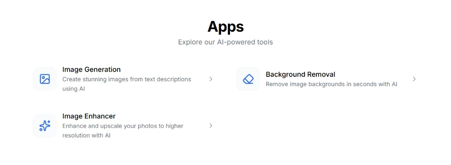
I left the chat and opened Apps, expecting a spread of tools.
The page carries a large Apps heading with a line under it about exploring AI powered tools. Three cards were on offer. Image Generation for creating pictures from text descriptions. Background Removal for stripping backgrounds out in seconds. Image Enhancer for upscaling photos to a higher resolution. Each card has a chevron on the right, so each opens into its own tool.
Three entries under a heading that grand felt thin, and all three are image tools. Nothing here touches documents or audio. Having just watched image generation get blocked behind the Pro wall in the chat, I had no reason to think the other two cards would behave any differently, and no way to check without paying.
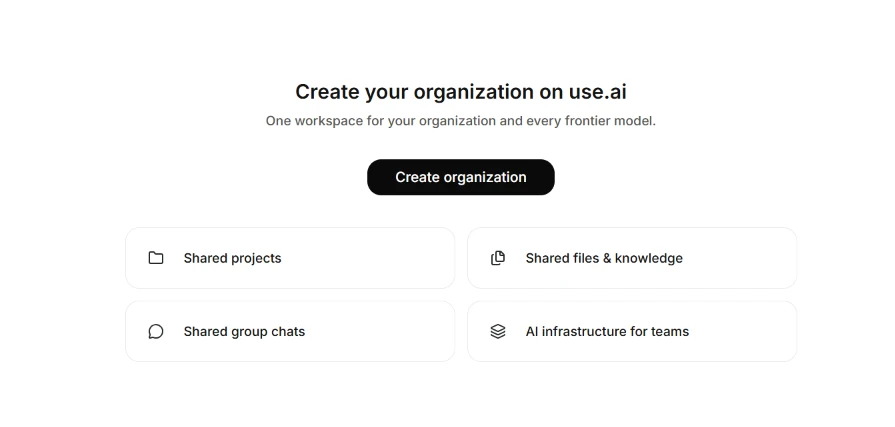
The next flow I tried was the organisation setup. The page opens with Create your organization on use.ai and a subtitle promising one workspace for your organization and every frontier model. A black Create organization button sits under it. Four cards run below in a grid: Shared projects, Shared files & knowledge, Shared group chats, AI infrastructure for teams.
The four cards look clickable. They are not. They are static descriptions of what an organisation gives you, which I discovered by clicking all of them.
The screen carries no price and no seat count. For a product that had already shown me a paywall twice by this point, leaving the cost of a team plan off the page where you ask someone to create a team is a strange choice. I stopped short of pressing the button because I had no idea what I would be committing to.
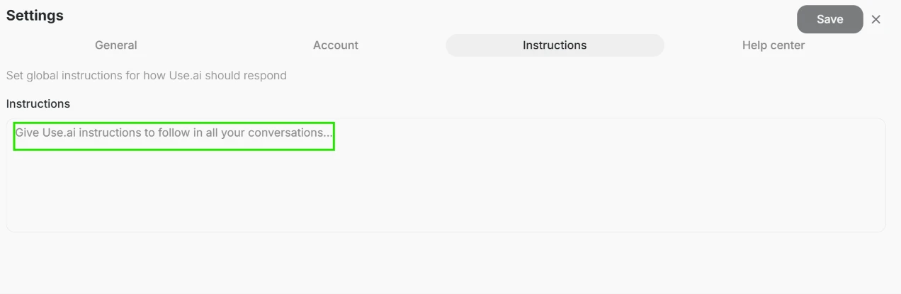
The last thing I opened was Settings. Four tabs run across the top: General, Account, Instructions, Help center. I went into Instructions.
It holds one thing, a wide text area with a placeholder reading Give Use.ai instructions to follow in all your conversations, plus a line above explaining that these are global instructions for how the tool should respond. A Save button sits in the top right, greyed out until you type something.
This is a system prompt written in plain language, and the scope is the whole account rather than one thread, which is more useful than a per chat instruction box. I typed a line in, saved it, and went back to the chat to watch it take effect. It did not, because the chat still answered my message with the same request to upgrade. The only setting I could edit for free is the only setting I had no way of testing.
| Dimension | Our test | User signal | Verdict | Composite |
|---|---|---|---|---|
| Text Answer Quality Relevance, depth, and clarity | 7.5 | 7 | Good | |
| Image Generation Accuracy of visual outputs | 4 | 3.5 | Weak | |
| Ease of Use Learning curve and navigation | 7.5 | 8 | Good | |
| Value for Money Utility relative to pricing | 5 | 4.5 | Weak | |
| Billing Transparency Clarity of charges and renewals | 3 | 2.5 | Weak | |
| Reliability and Uptime Stability and response consistency | 5.5 | 5 | Weak | |
| Customer Support Helpfulness and responsiveness | 4 | 3.5 | Weak |
Toolscopia uses cookies to keep you signed in, remember your preferences, and understand how our reviews get read. Analytics are anonymous. See our privacy policy for the full detail.



Comments 0
Join the discussion and share your perspective.
Sign in to post a comment and reply to other readers.
No comments yet
Be the first to share your perspective on this tool.