1
Natural-language input
Describe a chart in plain English and it builds one.
ChartGPT is an AI chart maker that turns pasted numbers or a plain-English description into a clean, presentation-ready chart in seconds, with free PNG, SVG, and PDF export and no account required.
Independent review — we test tools ourselves and analyze public user reviews. How we test.
ChartGPT earns a spot in the bookmarks bar for anyone who needs a decent chart fast. It reads messy data better than most people expect, picks a sensible chart type on its own, and exports in formats a US business actually uses. The catch is that it stops at "good enough" by design. You cannot set brand colors, you cannot refine a chart after it generates, and it tops out at nine chart types. For a quick internal chart or a draft before the real deck, it saves genuine time. For a polished, on-brand client visual, you will still finish the job somewhere else. Priced from free, the trade feels fair.
ChartGPT is a web-based chart generator that uses AI to read your data and build a visualization without any menus or formula setup. You paste a table, type raw numbers, or describe what you want in a sentence, and it returns a finished chart.
The tool is aimed at people who make charts under time pressure rather than data scientists. Analysts assembling client decks, founders putting together a board pack, and marketers turning campaign numbers into something presentable are the core users.
Everything happens in the browser with no software to install. Work is not saved on a server, so a chart exists only until you export it or close the tab. That design keeps your data private, since prompts and numbers are not stored or used to train the model.
ChartGPT runs on OpenAI language models for reading input, paired with its own rendering code for the actual charts. It is a focused single-purpose tool rather than a full analytics suite, and it treats that focus as the point.
Describe a chart in plain English and it builds one.
Drop in Excel, Sheets, CSV, or a markdown table.
Reads the data shape and picks a fitting type.
Bar, line, pie, donut, area, scatter, and three bar variants.
Redraws the same data in a new type instantly.
Skips totals rows, blanks, and merged headers on its own.
PNG at 2x, SVG, print PDF, and raw JSON.
Make charts with no account and no card.
Nothing is stored server-side or used for training.
We skipped the sales pitch and fed ChartGPT the kind of messy numbers a US analyst or founder actually deals with. Every test below ran on the free version with no account and no card.
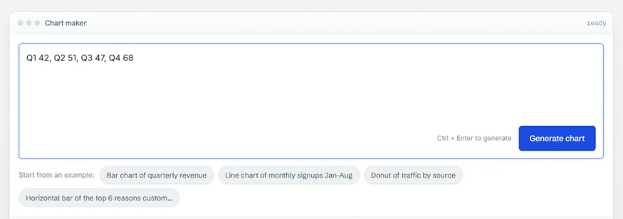
Our first test was the laziest input we could manage. We typed four quarters as plain text and nothing else.
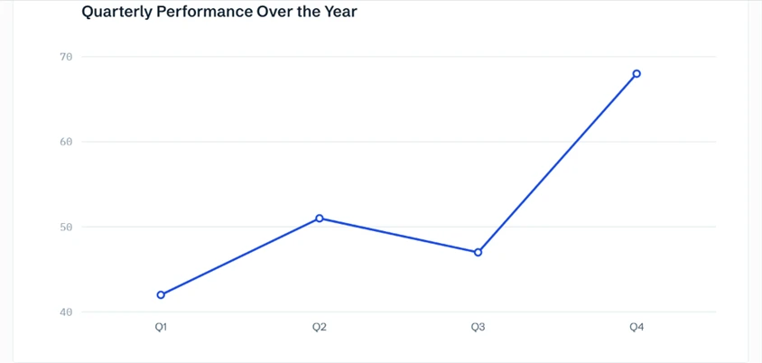
ChartGPT read it, picked a line chart, labeled the axes, and wrote its own title, “Quarterly Performance Over the Year.” We did not ask for a line chart. It chose one because the data is a time series, which is the correct call and a sign the tool reads intent rather than plotting blindly.
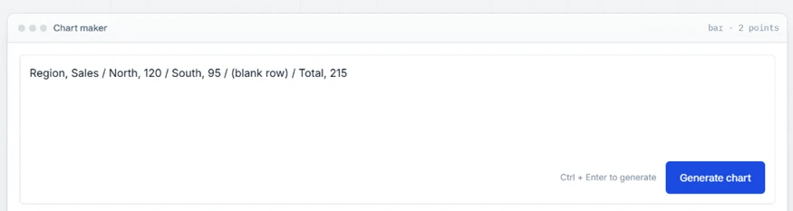
Real spreadsheet data is rarely tidy, so we handed it a deliberate mess: a header, two regions, a blank row, and a totals row.
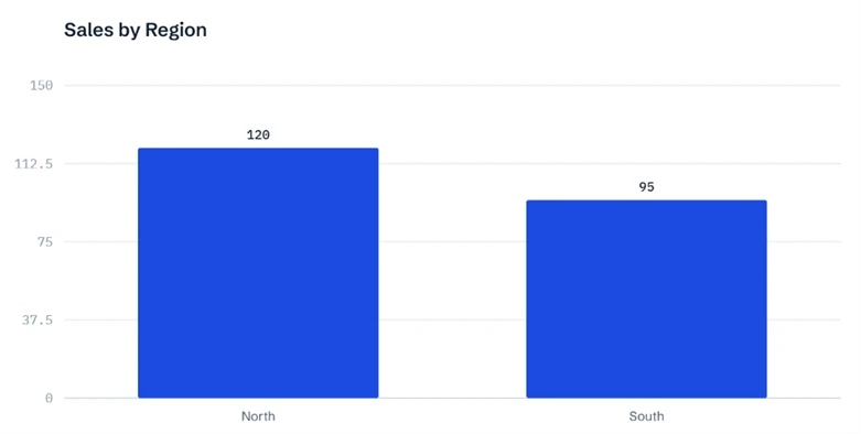
The result is the moment that sold us. The chart plotted North and South and quietly dropped the total and the empty row. The panel header even confirmed it read “bar · 2 points,” so we could see it kept exactly the two real values. A beginner pasting straight from Excel would get a correct chart without knowing they had dodged a classic mistake.
Below every finished chart sits a row of nine types and a set of export buttons.

We clicked Pie and the same regional data redrew at once, with percentages and a legend, no regeneration and no re-paste.
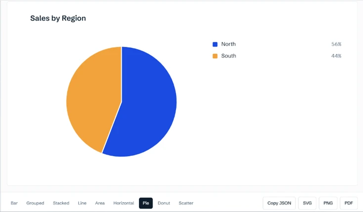
The export row is a real strength for anyone on the free plan. PNG at double resolution, SVG for sharp projection, and a print-ready PDF are all there without an upgrade prompt. A Copy JSON button hands you the chart specification if you want to rebuild it elsewhere.
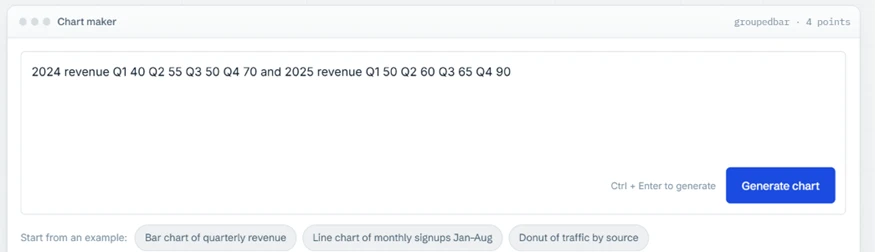
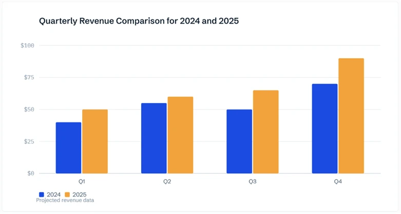
Consultants and founders rarely plot one series, so we gave it two years of quarterly revenue in a single run-on sentence.
It produced a grouped bar chart that would not look out of place in a board pack. Each year got its own color, a legend sat underneath, and the axis formatted itself in dollars from $0 to $100. It also added a quiet “Projected revenue data” note we had not asked for.
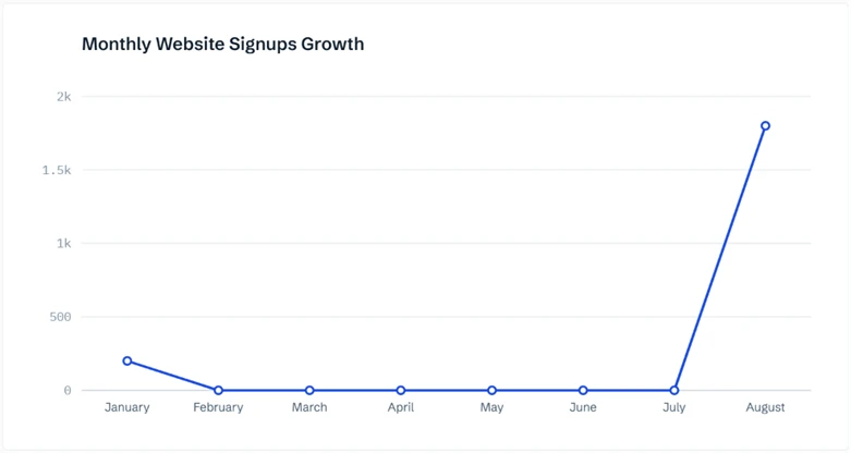
We described growth instead of giving every number, telling it signups “grew from 200 in January to 1800 in August.”
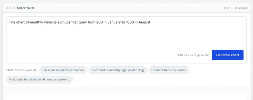
Here is the honest limit. ChartGPT plotted January at 200 and August at 1800, then set February through July to zero. It would not invent the six months we left out, which is the right instinct for a data tool. The trouble is what the viewer sees: a line that looks like a collapse and a late spike, with no note that the middle was missing. Give it only the endpoints and the picture misleads.
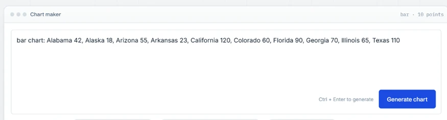
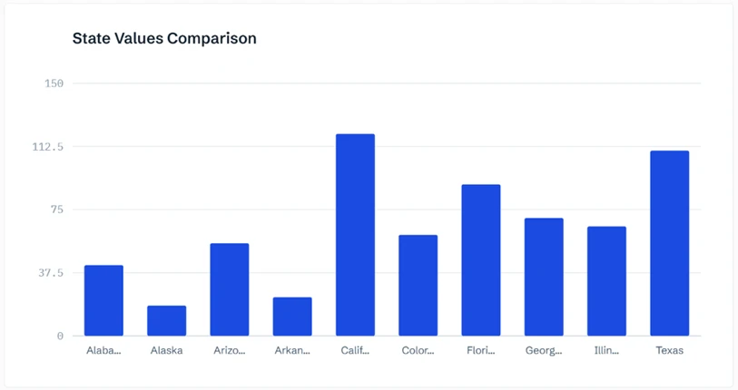
Our last data test used ten US states to see how it handles a wider set.
The bars were accurate, but the names clipped to “Alaba...,” “Arizo...,” and “Calif...,” with only Alaska and Texas fitting whole. There is no option to rotate or wrap the labels, though switching to the horizontal bar type would read better for a list this long.
Two fixed traits shape the whole experience. Once a chart is generated there is no input box to refine it, so you cannot ask it to sort, shorten a title, or relabel anything without editing your original text and running it again. Colors are not yours to set on any plan either. The built-in palette is designed to stay readable in greyscale and photocopies, which is thoughtful, and also means a chart cannot match a company's brand colors.
We finished on the pricing page to see what the free tier gives before anyone pays.
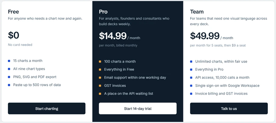
Free covers 15 charts a month, all nine types, PNG, SVG and PDF export, and pastes up to 500 rows, with no card required. Pro at $14.99 a month lifts the limit to 100 charts, and Team at $49.99 for five seats adds API access and single sign-on. One detail for US buyers: billing is issued with GST invoices, so expect India-style paperwork rather than US sales tax.
| Dimension | Our test | User signal | Verdict | Composite |
|---|---|---|---|---|
| Speed How fast a chart appears after you submit | 9 | 9 | Excellent | |
| Input Flexibility How well it reads pasted, typed, or described data | 9 | 8 | Excellent | |
| Output Quality How clean and presentation-ready the chart looks | 8 | 8 | Good | |
| Customization How much control you have over the finished chart | 4 | 4 | Weak | |
| Ease of Use How approachable it is for a first-time user | 9 | 10 | Excellent | |
| Chart Range How many chart types and shapes it covers | 6 | 6 | Moderate |
Toolscopia uses cookies to keep you signed in, remember your preferences, and understand how our reviews get read. Analytics are anonymous. See our privacy policy for the full detail.



Comments 0
Join the discussion and share your perspective.
Sign in to post a comment and reply to other readers.
No comments yet
Be the first to share your perspective on this tool.